Subway tiles possess a rare and enduring superpower within the world of interior design. They appear classic yet capable of adapting to almost any stylistic era, and they manage to make compact bathrooms feel organized without appearing overly fussy. Since their debut in the subterranean transit stations of New York City in the early 1900s, these rectangular ceramics have transitioned from sanitary necessities to beloved architectural staples. If you are currently planning a renovation, this comprehensive guide explores the practical choices required to execute this look perfectly. We will analyze tile finishes, grout color theory, complex layout patterns, floor pairings, and shower functionality so you can select a scheme that remains timeless while feeling distinctly personal.
You will find a detailed exploration below that moves beyond basic aesthetics. We will discuss specific tile decisions that you can copy, adjust, and confidently install in your own bathroom space to add value and comfort to your home.
The Enduring Appeal: Why This Rectangular Shape Still Works
Why has a simple 3 by 6 inch white rectangle remained at the forefront of bathroom design for over a century? The answer lies in the psychological effect of the shape. The rectangular geometry feels clean, logical, and inherently structural. It provides a sense of order in a room that is often small and cluttered with daily necessities. However, in a bathroom environment, a wall covering must do more than simply look attractive. It has to withstand high humidity, constant temperature fluctuations, splashes, and daily cleaning rituals.
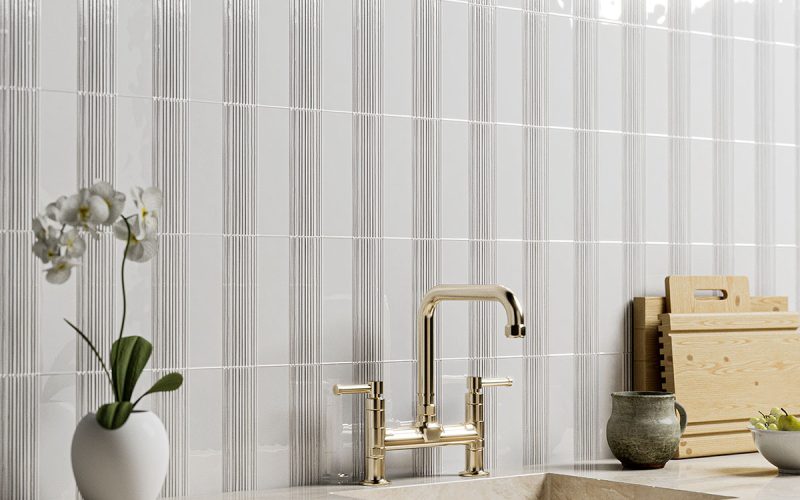
These glazed bricks excel in performance because their vitrified surfaces repel water and bacteria. Visually, they offer a unique tool for controlling the scale of a room. You can emphasize the grid to create a sense of rigid structure, or you can soften the lines to ensure the surfaces feel calm and retreating. When collecting inspiration for your project, begin by deciding what the walls should communicate. Do you desire a bright, reflective surface that bounces light around a windowless powder room? Perhaps you prefer a matte surface that absorbs light to create a soft, architectural mood. Once you determine the atmosphere, the subsequent design choices regarding layout and accents become significantly simpler.
White Wall Tiles: Choosing Between Traditional Gloss and Modern Matte
White rectangular tiling is popular for a legitimate reason. It acts as a neutral canvas that supports almost any fixture style, from antique brass faucets to modern matte black showerheads. In the context of long term home value, this neutrality gives you incredible flexibility. If you decide to change your vanity cabinet or swap out lighting fixtures five years from now, your white walls will likely still complement the new design direction. However, simply choosing “white” is not the end of the decision process.
The “temperature” of the white glaze matters. A stark, cool white can feel crisp and sanitary, perfect for modern minimalist spaces. In contrast, a creamy, warm white offers a sense of history and softness, often preferred in farmhouse or cottage style bathrooms.
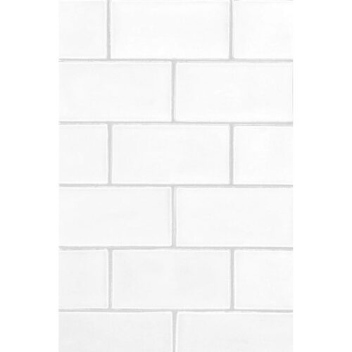
The finish is the decision that most homeowners underestimate. Glossy glazes are the traditional choice. They reflect light, which makes small bathrooms appear larger and brighter. They are also easier to wipe down, as the smooth surface offers no resistance to a cleaning cloth.
Conversely, matte finishes have gained traction in contemporary design. A matte white tile feels calmer, velvety, and more sophisticated. It hides dried water spots and toothpaste splatters better than high gloss surfaces, making it a pragmatic choice for children’s bathrooms. A sophisticated approach involves mixing finishes intentionally. Consider using matte tiles for the primary wall fields while utilizing a subtle glossy border or accent strip to introduce depth and dimension without introducing a new color.
Grout Selection: The Visual Eyeliner of Tiling
Grout is often treated as an afterthought, yet it is arguably the most impactful material choice after the tile itself. It functions much like eyeliner in makeup; it defines the shape. The color of the mortar between your tiles dictates whether the wall is perceived as a single continuous texture or a bold geometric pattern.
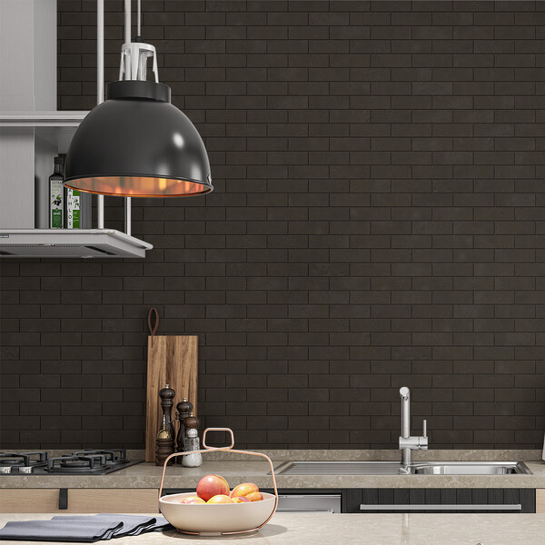
The Case for Black or Dark Gray Grout If you select a black or charcoal grout to pair with white tiles, the wall becomes a graphic grid. This high contrast look is sharp, industrial, and distinctly modern. It pairs exceptionally well with black floor details or Crittall style shower doors. However, be aware that dark grout highlights every imperfection in the installation. If the tiles are not spaced perfectly evenly, the dark lines will reveal the error immediately.
The Case for White Grout Choosing a bright white grout that matches the tile creates a monolithic look. The individual brick shapes recede, and the texture becomes subtle. This is excellent for small rooms where you want the walls to feel expansive rather than busy. It allows other elements, such as a statement mirror or a colorful vanity, to take center stage.
The Middle Ground: Soft Grays and Greige If you are nervous about the maintenance of white grout but find black too aggressive, choose a “matching” grout in a soft silver gray or warm off white. This defines the brick pattern gently without creating visual vibration. Practically, this is the smartest choice for a busy family bathroom because standard gray grout hides minor discoloration and soap scum much better than bright white or pitch black options. For long term durability, always speak with your installer about using epoxy grout or high quality sealers to ensure the lines remain crisp.
Master Layouts: Offset, Herringbone, and Stacked Patterns
The layout is where subway tiles transition from being a standard building material to a design feature. The way you arrange these rectangles changes the perceived proportions of the room.
Traditional Running Bond (Offset) This is the familiar brick pattern most people visualize. It creates a staggered look that mimics structural brickwork. It remains popular because it is forgiving. If your walls are not perfectly square, which is common in older homes, the staggered lines help disguise the irregularities.
The Herringbone Pattern If you desire movement and energy, herringbone is the solution. By laying the tiles at 90 degree angles to one another in a zigzag formation, you create a texture that looks high end and custom. This layout draws the eye upward and outward. It is particularly effective as a feature wall behind a vanity or inside a shower niche. Be advised that herringbone requires more cuts and labor, so it may increase your installation budget.
Vertical and Horizontal Stacking For a strictly modern or mid century aesthetic, stack the tiles directly on top of one another.
- Horizontal Stack: This widens the room visually and feels very orderly.
- Vertical Stack: This is a powerful trick for rooms with low ceilings. The vertical lines draw the eye up, making the ceiling feel higher. It creates a sleek, contemporary backdrop that looks fantastic with floating vanities and linear lighting.
Regardless of the layout you select, insist on a “dry lay” before installation begins. Ask your tiler to lay out a few rows on the floor. This allows you to see exactly how the cut pieces will land at the corners and edges.
Flooring Partnerships: What Pairs Best with Brick Walls?
Pairing wall ceramics with the correct flooring is what makes a room feel professionally designed rather than pieced together. Because subway tiles are geometrically simple, they allow for interesting patterns on the floor.
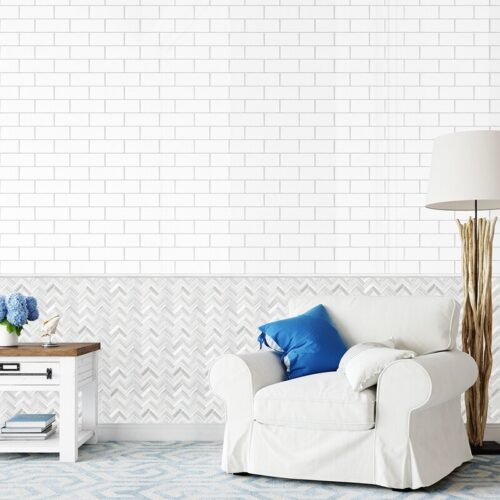
Hexagon and Penny Rounds Small scale hexagon tiles are the classic partner for subway walls. This combination has been used since the 1920s and remains fresh today. The abundance of grout lines in a hexagon floor provides excellent slip resistance, making it safe for wet feet.
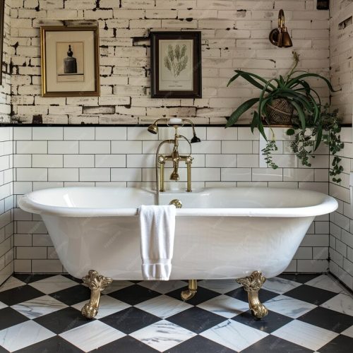
The Checkerboard Floor For a bolder, vintage character, a checkerboard pattern creates a stunning foundation. Whether executed in black and white marble or softer beige and cream tones, the large scale geometry of the floor contrasts beautifully with the smaller scale of the wall bricks.
Basketweave and Stone Mosaics Basketweave patterns add a woven texture that feels luxurious and old world. When paired with simple ceramic walls, a marble basketweave floor elevates the entire room to a hotel quality level. If you choose this route, keep the wall tile simple. If both the floor and the wall have loud patterns, the room will feel chaotic.
Designing the Shower Zone: Function Meets Style
A subway tile shower succeeds when the practical decisions are prioritized during the planning phase. The shower is a wet environment that requires meticulous attention to waterproofing and layout.
First, determine the “focal wall” of the shower. This is usually the wall housing the plumbing fixtures or the long back wall. You might choose to change the pattern here or use the same layout throughout for continuity. Many homeowners prefer glossy tiles in the shower because soap scum wipes off glass like surfaces easily. However, matte porcelain is denser and incredibly durable.
The Niche and Corners A recessed niche is essential for holding shampoo bottles without cluttering the floor. Plan the niche location so that your tile lines frame it perfectly. You want to avoid slivers of small cut tiles around the edges. This requires your installer to calculate the layout from the niche outward.
Ceiling Considerations Should you tile the shower ceiling? In a steam shower or an enclosed space, tiling the ceiling is highly recommended for moisture protection. It also creates a “jewel box” effect that feels cozy and finished. If you tile the ceiling, continue the same pattern from the walls to maintain visual height.
The Vanity Backsplash: Protection and Aesthetics
The area behind the sink is a high impact zone. It is where function and style collide every morning. Splashes from face washing and tooth brushing can ruin painted drywall quickly. A backsplash of ceramic tile protects the wall and visually frames the vanity cabinet.
You have several options for height. You can run a standard 4 inch splash, but this often looks dated. A more modern approach is to tile from the countertop all the way to the ceiling behind the mirror. This creates a vertical column of texture that highlights your lighting fixtures. Alternatively, you can install a wainscot height splash (usually 42 to 48 inches from the floor) that wraps around the entire room. This unifies the space and offers protection for all walls.
Pay attention to how the tile terminates. If the tile ends in the middle of a wall, you need a clean edge. You can use a “bullnose” tile which has a rounded glazed edge, or a metal Schluter strip for a sharp, contemporary line.
Strategic Accents: Knowing When to Add Detail
Accent tiles can add personality, but restraint is key to keeping the design timeless. In the past, horizontal bands of glass mosaic running through the middle of a shower were popular. Today, that look can feel dated.
A more reliable approach is to treat the floor of the shower or the back of a niche as the accent. Use a marble mosaic, a penny round, or a herringbone sheet in these smaller defined areas. This adds a layer of luxury without overwhelming the main field of tile.
If you love color, consider a “jewel tone” accent. Deep emerald green or navy blue subway tiles used as a wainscot can look striking against white upper walls. This adds drama while maintaining a traditional structure.
Material Science: Ceramic, Porcelain, or Glass?
Understanding the material composition helps you predict durability.
- Ceramic: This is made of clay that is fired in a kiln. It is easier to cut, which makes it great for DIY projects or complex layouts around outlets. It is generally the most affordable option.
- Porcelain: This is made of finer clay and fired at higher temperatures. It is denser and impervious to water. Porcelain is the superior choice for shower floors or steam rooms where moisture absorption is a concern.
- Glass: Glass tiles offer depth and luminosity that ceramic cannot match. However, they are more difficult to install. You can see the adhesive through the tile, so the installer must be very skilled to avoid streaks. Glass can also crack if the wall shifts or settles.
For a standard bathroom wall, ceramic is usually sufficient. For floors and heavy use wet zones, porcelain is the gold standard.
Creating a Renovation Master Plan
A successful renovation relies on managing constraints such as budget, timeline, and existing plumbing. Before you purchase a single box of tile, verify your square footage and add at least 15 percent for “overage.” This accounts for cuts, breakage during shipping, and future repairs. It is critical to order all your tile from the same “dye lot” or batch. Ceramics fired on different days can have slight color variations that are visible when installed side by side.
Focus on details that age gracefully. Consistent grout spacing (usually 1/16 or 1/8 inch for subway tiles) ensures a clean look. Think about built in storage options like ledges or corner shelves. These should be integrated into the tile layout, not glued on afterward.
Maintenance should be part of your plan. If you live in an area with hard water, avoid dark tiles in the shower as they will show white mineral deposits. If you hate scrubbing grout, choose larger format subway tiles (such as 4 by 12 inches) to minimize the number of grout lines.
Final Thoughts on Timeless Design
The beauty of subway tile lies in its chameleon like ability to suit any home. It can be rustic, industrial, modern, or traditional depending entirely on the choices you make regarding finish, grout, and layout. By sticking to this classic shape, you are investing in a material that will not look obsolete in a decade.
Remember that the goal is not just to cover a wall, but to create a backdrop for your life. Whether you choose a calm matte white stack for a spa like retreat or a glossy herringbone pattern for a spirited family bath, the principles remain the same. Plan your layout, respect the grid, and let the simplicity of the form bring order and elegance to your sanctuary.
Key Takeaways for Your Project
- Light and Scale: Use glossy finishes in small, dark rooms to maximize reflected light.
- Grout Impact: Remember that high contrast grout creates a busy, graphic look, while low contrast grout creates a soothing, seamless surface.
- Layout Logic: Use vertical stacking to raise the ceiling; use herringbone to create a feature focal point.
- Floor Pairing: Contrast the rectangular wall bricks with geometric floors like hexagons or basketweaves for a curated appearance.
- Preparation: Always order 15 percent extra material and dry lay your pattern to catch awkward cuts before they are adhered to the wall.