A great backsplash tile choice can make a kitchen feel brighter, cleaner, and more intentional without requiring a full remodel. In this guide, you will learn how to compare tile materials such as glass, ceramic, porcelain, and stone. You will also discover how to pick a white-forward or gray-forward palette and use sample testing to avoid expensive surprises. It is worth reading because the right tile is rarely just about looks. It is also about texture, finish, maintenance, and how everything works together in real light.
What tile works best for a kitchen backsplash?
The best tile for a kitchen backsplash depends entirely on your cooking habits, your tolerance for upkeep, and the specific aesthetic you want to achieve day-to-day. If you want a low-fuss surface that still feels stylish, porcelain and ceramic are incredibly popular because they resist stains and handle heat well. These materials are fired at high temperatures, creating a non-porous surface that prevents sauce splatters or grease from penetrating the tile body. If your goal is an airy and light-reflective look, a white palette can make the whole kitchen feel more open, especially when your lighting is limited or when you have fewer windows.
Start by anchoring the decision around the elements you already have in place. Look closely at your cabinet tone, your hardware finish, and the countertop material. A smart design approach is to treat the backsplash as the bridge that helps match warm and cool elements rather than fighting them. For example, if you have cool gray counters but warm oak cabinets, a backsplash that incorporates both warm beige and cool white tones can tie the room together visually. If you feel overwhelmed by the endless options, use this rule to find the best direction. Pick one hero element, which could be white, gray, or beige, and then choose a complementary texture and finish to support it.
Also consider where the tile will stop and start. This is often overlooked but critical for a professional finish, especially around outlets and windows. In some layouts, using larger wall tiles reduces the number of grout lines. Fewer grout lines mean less scrubbing and makes the surface easier to keep looking white and fresh over time. If you want a statement design without creating visual chaos, this is where a single accent strip or a controlled mosaic moment can add personality. You do not need to cover every inch of the wall in a loud pattern to make an impact. Sometimes, restraint is the key to a timeless kitchen design.
Mosaic design: When do mosaic tiles make sense?
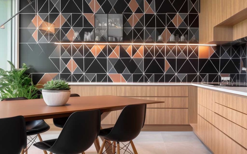
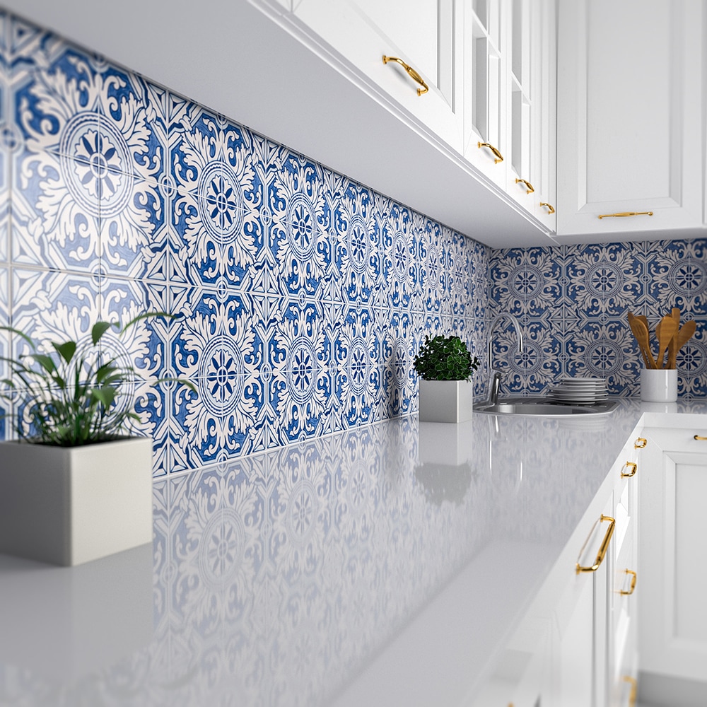
Mosaic is ideal when you want movement, detail, or an intricate focal point behind a range or sink area. Because mosaic tiles add more grout lines to the surface, they naturally introduce more texture and visual energy than a single large tile. This can be perfect for a compact kitchen where you want jewelry on the wall to draw the eye. A white mosaic can read classic and timeless, evoking a sense of historical charm, while a gray mosaic can feel more contemporary and industrial depending on the material used.
The key to successfully using mosaic is choosing the right scale and pattern so the surface does not look busy from across the room. For example, mosaic tiles in a small square format can look crisp and tailored, offering a geometric rigidity that works well in modern spaces. In contrast, a mixed-shape mosaic can feel more organic and softer. If you are mixing materials, such as combining glass with stone in a single sheet, keep the color range tight. Monochromatic blends ensure the overall design still feels intentional and sophisticated rather than cluttered or accidental.
Use a sample board to test how the mosaic behaves at different times of day. This is a critical step because the small facets of mosaic tiles catch light differently than large slabs. A white mosaic might look clean and bright at noon but slightly warm or yellow at night under under-cabinet bulbs. Similarly, a gray mosaic can shift cooler or even blue than expected in the evening. That quick test often saves you from purchasing a beautiful product that simply does not match your real lighting conditions. Furthermore, consider the grout color carefully with mosaics. A high-contrast grout will emphasize the grid and shape of every tiny tile, which creates a very busy look. A matching grout color will soften the appearance, making the texture the star rather than the grid lines.
Marble vs porcelain: Which finish holds up best?
Marble delivers a luxurious and high end look that many homeowners love, especially in varieties with white backgrounds or soft gray veining like Carrara or Calacatta. It is also naturally varied, meaning no two tiles are exactly alike. This gives the space immense depth and character even when the tile layout is simple. However, the tradeoff is that marble is a natural stone composed largely of calcium carbonate. This makes it more sensitive to staining from acidic foods like lemon juice or tomato sauce, and it is prone to etching. The finish you choose and how you maintain it matters significantly. A honed finish may hide etching better than a polished one, but it is more porous and requires strict sealing protocols.
Porcelain is the practical counterpoint to natural stone. It can mimic marble convincingly while staying much more forgiving in a busy household. Modern digital printing technology allows porcelain manufacturers to replicate the veining and depth of real stone with incredible accuracy. Many porcelain tiles come in both matte and polished finish options, so you can tune the look from sleek to subtle without taking on as much maintenance risk. If your kitchen gets heavy use or if you are an enthusiastic cook who worries about splatter, porcelain can be a durable choice that still reads classic rather than purely utilitarian. You get the aesthetic elegance without the anxiety of ruining the surface with a stray drop of vinegar.
If you are deciding between them, do a side-by-side sample test with the grout color you plan to use. A white grout can make marble feel seamless and monolithic, but it can also make a porcelain marble look read more like a printed image if the pattern repeat becomes noticeable. Real marble has infinite variation, while porcelain will eventually repeat its pattern. Testing a sample in your actual space is often the simplest way to decide. Place a lemon slice on the sample of the marble overnight to see if the etching bothers you. If the resulting dull spot drives you crazy, porcelain is likely the better investment for your peace of mind.

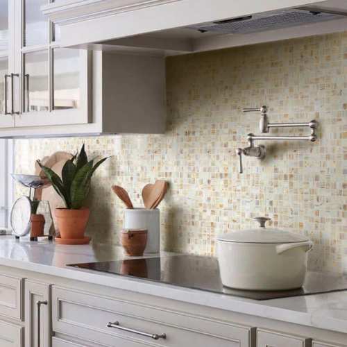
Glass backsplash tile: How do light and color change the look?
Glass is all about light. It is about how light bounces off the surface, how it softens shadows, and how it makes a small kitchen feel brighter and larger. If you love a clean and modern look, glass can deliver that crispness, especially in white or pale gray tones. However, glass is uniquely sensitive to its environment. Even a small shift in color temperature, such as switching from warm white to cool daylight bulbs, can change the perceived shade of glass dramatically. This is because light actually penetrates the glass body before reflecting back, picking up colors from the surrounding room. Testing matters here more than almost anywhere else.
One reason people choose glass is the depth it provides. Some options have a slightly layered look that adds dimension without needing a complex pattern. The light plays within the thickness of the tile itself. If you want a gentle shimmer rather than full high gloss shine, look for glass tiles with a softened surface texture or a frosted, satin-like finish. That combination can feel stylish and sophisticated without turning your backsplash into a mirror that reflects every dirty dish in the sink. Frosted glass also tends to show fewer water spots and fingerprints than clear, glossy glass, making it slightly easier to live with.
If you are shopping specifically for glass backsplash tiles, pay close attention to the edge quality and the backing color. Both affect how white the tile reads once installed. Clear glass often has a slight green tint due to iron content, which can turn a white wall into a seafoam green wall. Low iron glass is clearer but more expensive. Additionally, the color of the adhesive used to install glass tile is paramount. You must use a bright white thin set mortar. If your installer uses a gray mortar, it will show through the translucent glass and darken the entire installation, ruining the bright effect you paid for. Many collections are available in many colors, but the right one is the one that stays consistent in your lighting. If possible, bring home a sample and view it in the morning and at night before committing.
Stone style guide: Limestone, travertine, slate, and onyx what’s the difference?
Stone brings a natural warmth that is hard to replicate with man made materials, especially if you want a grounded and earthy style. Natural stone can also introduce subtle variation that keeps a backsplash from feeling flat, even in a mostly white or beige scheme. The key is understanding how each type behaves visually and practically, as they all possess different geological properties.
Limestone tends to feel soft and airy. It often works beautifully with white cabinetry and a calm, traditional mood. It usually comes in muted tones of cream, beige, and soft gray. However, it is very porous and needs to be sealed well. Travertine usually reads warmer and more textured. It is characterized by natural pits and voids, which are often filled with resin or grout during manufacturing or installation. This makes it a strong option if you want rustic character without going dark. Travertine brings a sense of Old World charm that pairs excellently with bronze hardware and cream cabinets.
Slate typically leans moodier and fits a different aesthetic entirely. It can pull deep gray, charcoal, or even multi-colored hues of rust and green. The texture is often cleft, meaning it is rough and layered. This fits well in a more modern or industrial setting when you want high contrast against light cabinets. It is incredibly durable but can be dark, so good lighting is essential. Onyx is the wild card of the stone world. It is translucent and banded, looking luxurious and dramatic. However, it is soft and brittle. It is often better used as a feature panel or a small accent rather than an all over solution for a high traffic kitchen. If you love the idea of natural stone, start with a sample of limestone or travertine first, then compare it to slate under your lighting. That quick comparison clarifies whether your kitchen wants soft beige warmth or cooler gray depth.
White backsplash tile ideas: Subway tiles, square layouts, or chevron pattern?
White is popular because it is flexible, bright, and forgiving across changing decor trends. It reflects light, making spaces feel larger, and it feels hygienic, which is ideal for a cooking space. But saying you want white tile is just the beginning. Your pattern choice is what determines whether it feels classic, modern, or playful. A white backsplash can also serve as a neutral canvas to highlight other materials, like floating wood shelves or dark matte black hardware, without fighting for attention.
Subway tiles remain a go-to because they are simple and timeless. Originally used in transit systems, they have become a staple of residential design. They work with nearly any cabinet style, from farmhouse to ultra-modern. If you love a heritage look, classic subway tiles in a slightly warm white can feel inviting and traditional. You can lay them in a standard brick pattern, or for a slightly more modern twist, stack them vertically or horizontally. For a more tailored layout, a square format creates a clean grid that feels calm and architectural. Square tiles, specifically 4×4 or 5×5 inches, are seeing a resurgence in design for their nostalgic yet orderly appeal.
If you want movement, chevron is a strong option, especially in white, because it adds energy without needing multiple colors. The zigzag pattern draws the eye up and down, creating a dynamic rhythm. Just remember that a chevron layout increases the number of cuts required and the planning time. You will need to buy extra tile, usually at least 15 to 20 percent more than your square footage, to account for the waste generated by cutting the angles. You must also confirm your installer is comfortable with the pattern, as keeping the points aligned requires skill. Always test a sample with the exact grout shade you intend to use. Grout can shift a white field tile from crisp to creamy instantly. A gray grout defines the pattern, while white grout makes the texture subtle.
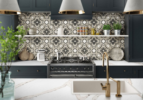
Gray and beige backsplashes: How do you choose a modern or rustic style?
Gray can read polished and contemporary, but it can also feel cold if it is not balanced with warmer tones. Beige can warm things up and create a softer and more welcoming vibe, especially when paired with natural textures like wood floors or butcher block islands. The best approach often is not picking one or the other but choosing a controlled blend called “greige” that supports your overall style. This hybrid tone offers the modernity of gray with the livability of beige.
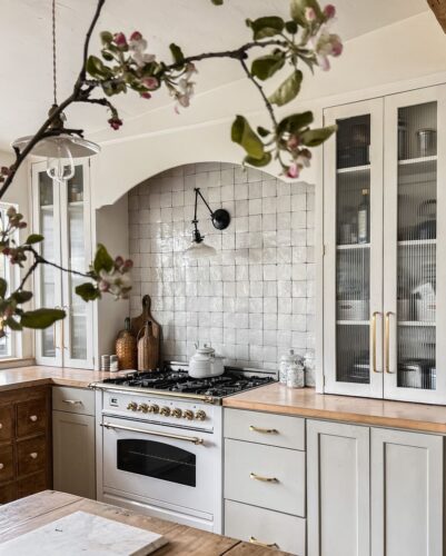
For a modern look, pair a light gray tile with a simple finish and minimal pattern so the surface stays sleek. Large format gray tiles with rectified edges allow for tiny grout lines, creating a concrete-like seamlessness that is very current. If you prefer rustic character, look for handmade-look ceramic or textured stone vibes that introduce variation and depth. Tiles with a “zellige” look, which have uneven surfaces and edges, reflect light in a shimmering, organic way that adds soul to a gray or beige wall. The trick is to keep the color range consistent so the backsplash does not compete with counters and cabinets.
If you are uncertain, use a sample trio strategy. Pick one pure gray option, one pure beige option, and one blend option. View them next to your cabinet door and under-cabinet lighting, then step back across the room. Do not just look at them up close. Design is experienced from a distance. That small test reveals whether gray is sharpening your kitchen or making it feel flat and dreary. It also shows whether beige is warming the space pleasantly or turning it too yellow and dated. Pay attention to the undertones in your countertop as well. If your granite has pink specks, a yellow-beige tile will clash. If your quartz has cool blue veins, a warm beige might look dirty next to it.
Texture and finish: Matte, glossy, pearl what matches your aesthetic?
Texture is the quiet detail that makes a backsplash look intentional instead of generic. While color grabs your attention first, texture determines how the surface feels and how it interacts with the room’s lighting. A glossy finish reflects light powerfully. It can keep a white surface feeling extra bright and expansive, effectively doubling the light in the room. However, high gloss also highlights smudges, water spots, and grease splatters more easily. You will find yourself wiping it down more often to maintain that pristine shine.
Matte finish hides fingerprints and smudges much better. It absorbs light rather than reflecting it, creating a soft and velvety appearance. This often feels more relaxed and understated, which can be ideal for a busy kitchen where perfection is not the goal. Matte finishes are excellent for hiding texture differences in the wall behind the tile as well. A pearl-like finish sits in the middle. It catches light gently without full reflection, adding a subtle glow that feels refined and expensive. If you like a modern look but do not want the aggressive shine of gloss, pearl or satin finishes can be a smart compromise. This is also where you can add a single decorative moment, like a small insert or a narrow band, without changing the whole field tile.
When comparing options, do not just look at the front face. Run your hand across the surface and notice the texture. Some finishes feel smooth to the touch but still scatter light visually. Others have deeper physical texture, such as raised patterns or 3D waves. While these 3D tiles are stunning, understand that deep texture can trap grease and dust near the cooktop. Cleaning a 3D wave tile behind a stove can be a nightmare if you cook with oil frequently. A sample viewed under real light is the only reliable way to judge whether the finish fits your day to day reality and cleaning habits.
How to use a sample to shop smarter and finalize selection?
A sample is your best decision tool because a tile can look completely different in your home than it does online or in a showroom. Showrooms use professional lighting with high color rendering indices, designed to make everything look perfect. Your home has a mix of daylight, warm evening bulbs, and shadows. Bring home at least two options, ideally a white candidate and a gray or beige candidate, so you can compare rather than guess. This step also helps you confirm whether the tile reads too warm, too cool, too shiny, or too flat in your specific context.
To shop efficiently, treat sampling like a mini experiment. Tape the sample to the wall in the vertical position it will be installed. Do not lay it flat on the counter, as light hits vertical and horizontal surfaces differently. View it next to the countertop and the cabinets. Check it under morning daylight when the sun is cool and bright. Check it again under evening artificial light when the ambiance is warmer. If you are choosing for a kitchen or bathroom, remember that humidity, lighting, and mirror reflections can change how white and gray tones read, so test in the right room whenever possible.
As you narrow it down, commit to one clear selection and order enough for waste, cuts, and future repairs. The industry standard is to order 10 to 15 percent extra. If you are doing a complex pattern like herringbone or chevron, order 20 percent extra. Ask the seller to provide the same lot number for all boxes when possible. Tiles are produced in batches, and shade variation can happen between firings. A “white” tile from batch A might be slightly creamier than batch B. Also confirm the product is available and not discontinued. Tiles are available today and gone tomorrow in some collections, so ordering at the right time matters. Do not wait until the installer is in your driveway to order the tile.
FAQ: Installation foundation, how to clean, and how to keep it durable
FAQ time: the most common failure point is not the tile itself. It is the foundation underneath it. A flat, properly prepared wall is non-negotiable. If the drywall is wavy or bumpy, the tile will not sit flat, resulting in “lippage” where one tile edge sticks out higher than its neighbor. This ruins the look and creates shadows. The right thinset and careful layout lines prevent these uneven joints. If you are using marble, stone, or glass, confirm compatibility with adhesives and grout. Some natural stones are porous enough to absorb pigment from colored grouts, leading to “picture framing” stains around the edges.
For maintenance, the goal is to clean regularly without damaging the surface. Most porcelain and ceramic surfaces tolerate gentle cleaners well. You can use standard household sprays without much worry. However, natural stone often needs more care and usually requires sealing upon installation and periodically thereafter. The sealer buys you time to wipe up spills before they stain, but it does not make the stone invincible. Avoid abrasive pads on polished stone or glass, as they can scratch the finish permanently. If you choose a heavily textured tile, understand that texture can hold onto splatter, so you will wipe more often near the stove.
Finally, plan for longevity. Pick a layout and color you will still like in five years, not just what is trending on social media today. Trends move fast. A bright pink geometric tile might look fun now, but will you love it every morning for the next decade? A white backsplash remains a timeless anchor that allows you to change paint colors and accessories easily. Controlled gray accents can add depth without becoming dated. If you want a look that stays stylish, keep the pattern readable, the finish practical, and the material appropriate for real cooking.
Key takeaways
- Sample Testing is Vital: Use a sample to confirm how white, gray, or beige tones look under your specific lighting conditions before buying.
- Material Matters: Choose material intentionally. Porcelain and ceramic are practical and durable. Marble and stone feel luxurious but need care. Glass boosts light but requires careful installation.
- Finish Affects Lifestyle: Pay attention to texture and finish because they affect cleaning effort, glare, and the overall style of the kitchen.
- Pattern Sets the Tone: Pick a pattern like subway tiles, square, chevron, or mosaic that fits your space proportions and your installer’s skill level.
- Preparation is Key: Treat prep work as the foundation of a durable installation. Flat walls, the right adhesives, and correct grout choices prevent failure.